A design system for a one-designer team
Building the foundation that lets one designer ship at the pace of a three-engineer team
Role
Sole owner of the system. Built and maintained as Lead UX/UI Designer (August 2023 - February 2026), continuing as Lead Designer.
Timeline
System started in early 2024, evolving since.
Team
Used daily by a 3-engineer team (iOS, Android, backend).
Shipped
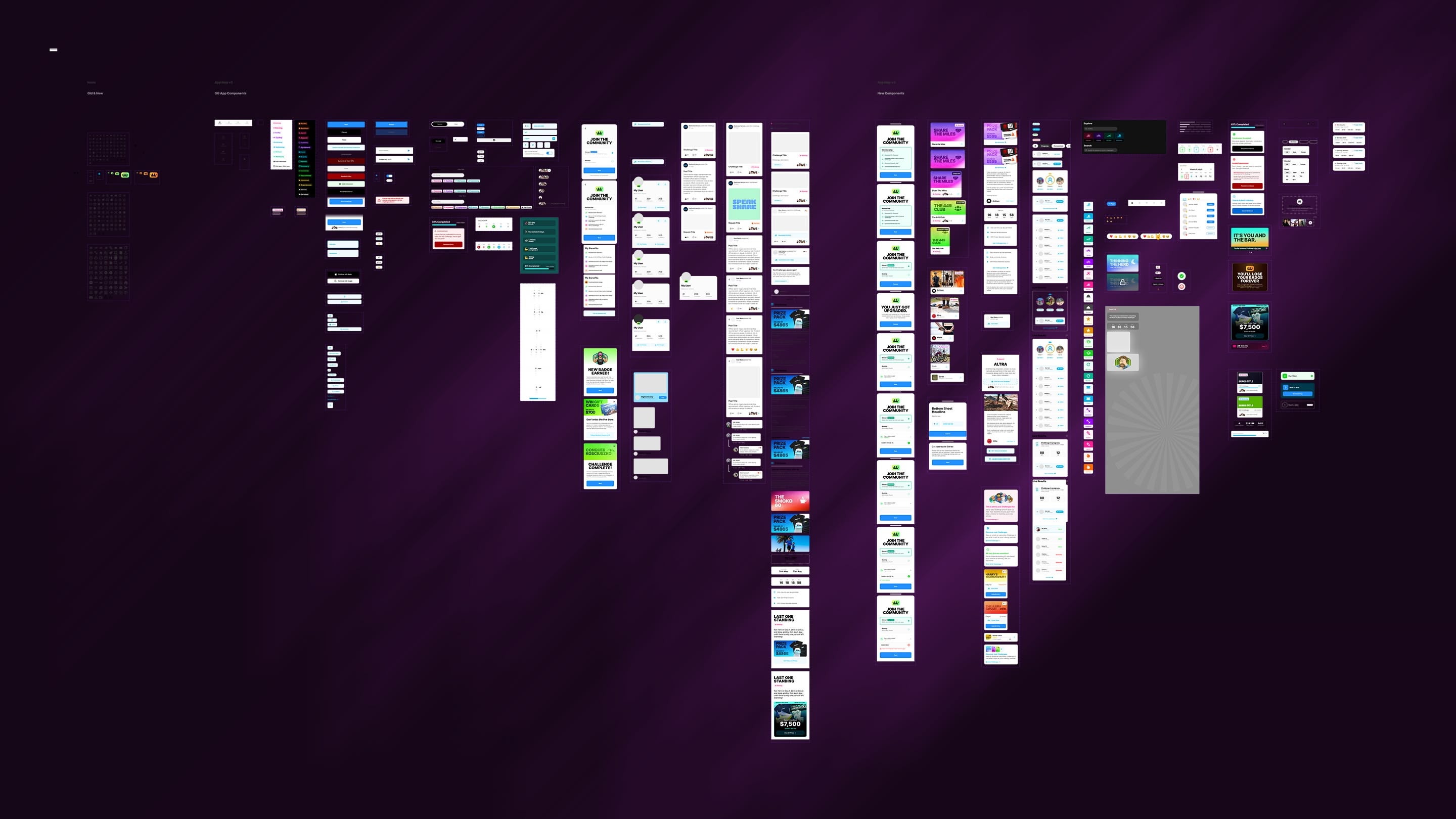
87 components, 601 variants, 337 live production screens, 148 in pipeline. A token-driven foundation built on Figma Variables for color, type, spacing, and radius, with modes for theming. Text styles, effect styles, and a documented dev handoff workflow.
Context
There was no design system when the app started shipping. There were Figma frames, repeated styles, and the assumption that a small team could move fast and stay consistent through discipline alone.
That assumption broke around month six. Screens started diverging in subtle ways. A button radius that was 12 on one surface was 14 on another. The same content card had three different shadow values across three flows. Engineering kept asking “is this on purpose or did the design just change?” and most of the time the answer was that I hadn’t realised the inconsistency was there. Shipping speed had bought entropy.
The cost of letting it run was clear. Every new feature would build on a foundation that was 80% consistent and 20% drift, and the drift would compound. The cost of stopping to systematise was a few weeks of focused work. I made the call to invest the weeks.
Process
The work started with an audit. I went through every live screen, documented every divergence, and grouped them by component type. That audit became the spec for what the system needed to do.
From there I worked atomic up.
Tokens first. Color, type, spacing, and radius. I set up Figma Variables for each, with modes that let the same component render across theming contexts without forking. Naming followed a strict pattern so engineering could mirror it on the code side.
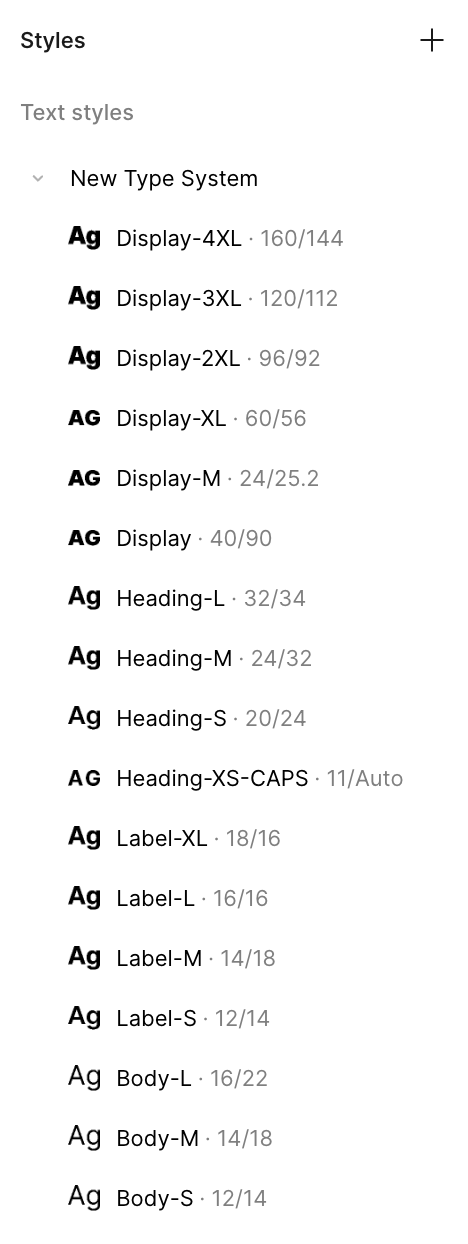
Text styles next. Every typographic role in the product got a named style. No frame in the system should use a manual font size after this point.
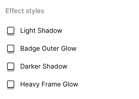
Effect styles. Shadows, blurs, and overlays became a small set of named effects rather than ad-hoc values per surface.
Components last. Once the foundation was solid, I rebuilt each component on top of the tokens. Every variant matrix was modelled in Figma so engineering could see every state in one place rather than discovering them screen by screen.
Then the migration. I didn’t rebuild every existing screen at once. New work shipped on the new system. Old screens got migrated as I touched them for other reasons. Within three months, the system was the default.
Solution
Foundation layer
Figma Variables for color, type, spacing, and radius. Modes for theming. Effect and text styles fully codified. Naming designed to map cleanly to the engineering side so the same token in Figma and in code is the same token.
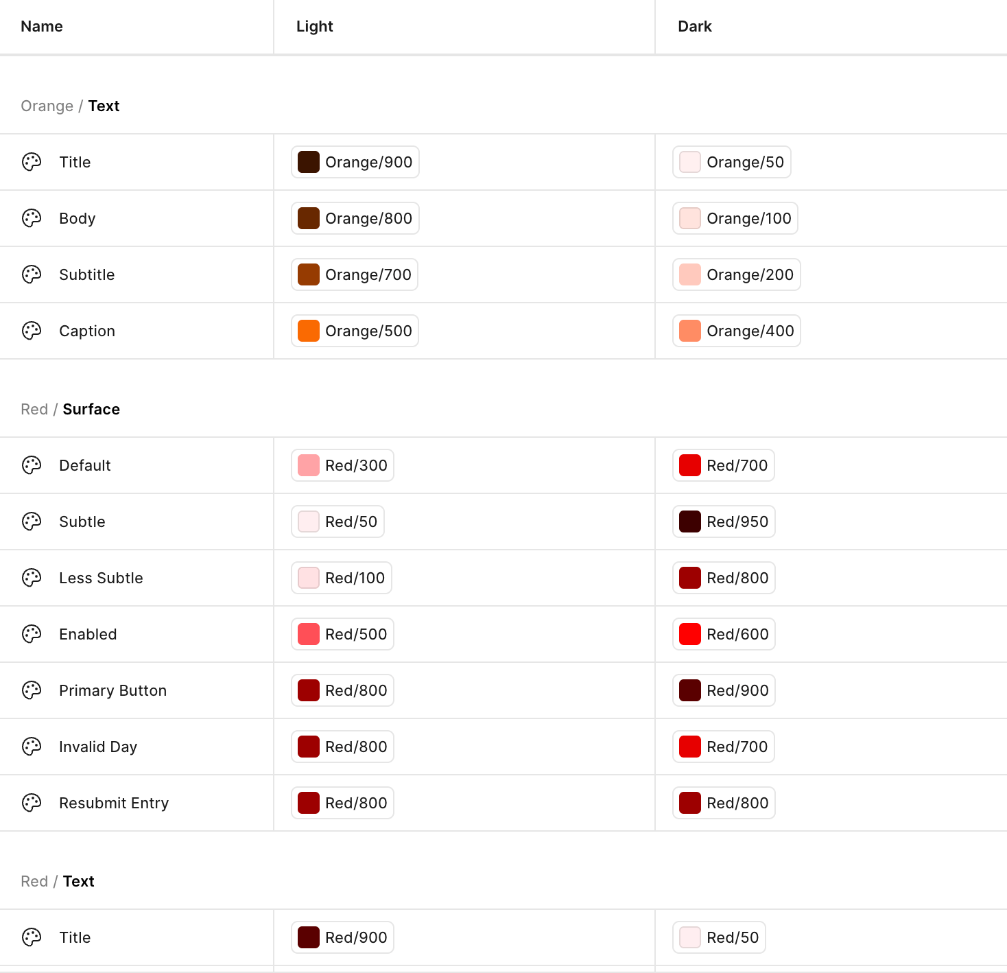
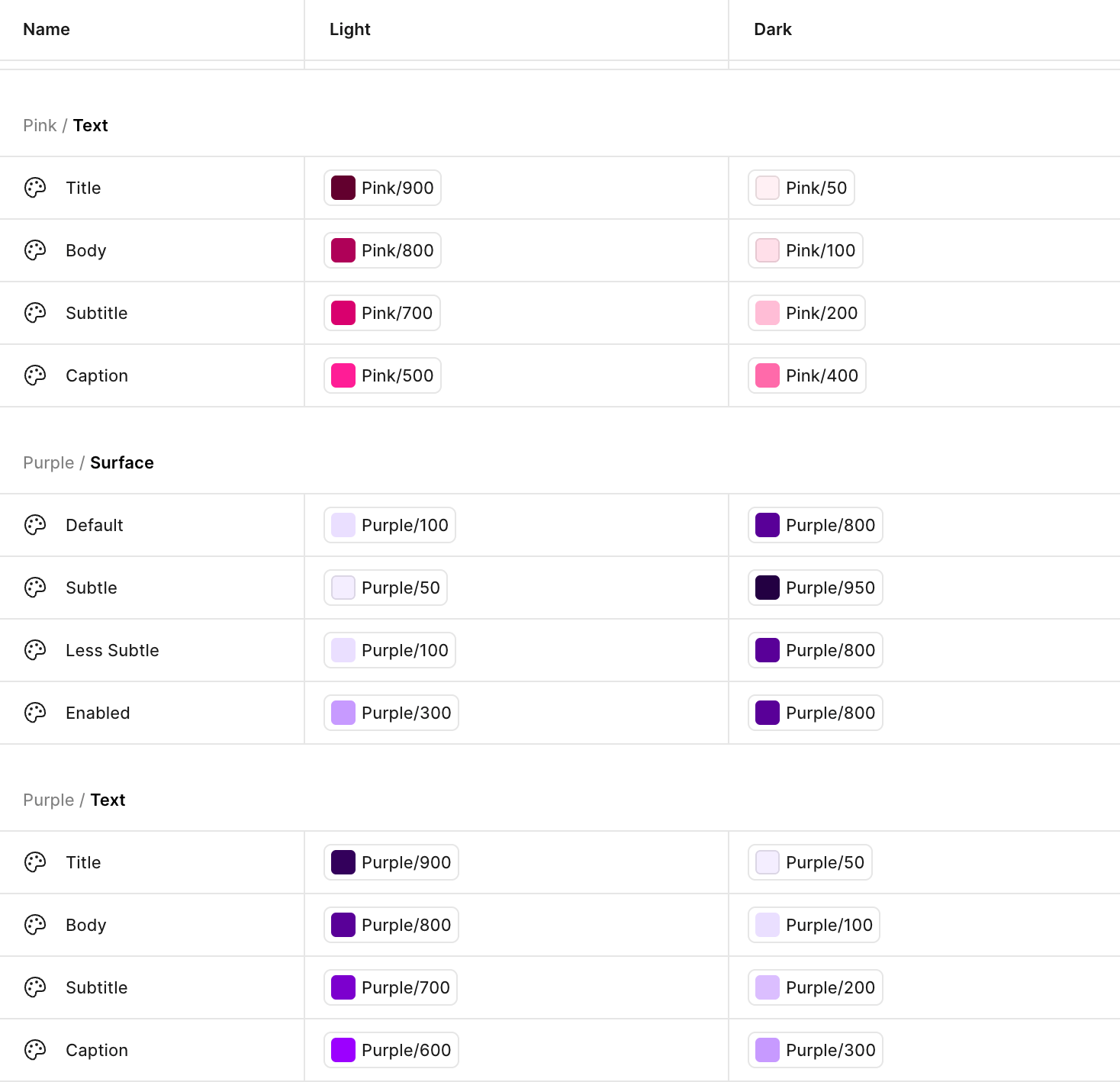
Colour. Two layers, mode-aware. The base layer is a numeric scale of tokens from 0 through 1000 in steps of 25, holding every raw value the system will ever need. The mapped layer sits on top and assigns those base tokens to semantic roles: text tokens (Title, Body, Subtitle, Caption) and surface tokens (Default, Subtle, Less Subtle, Enabled). Each mapped token resolves to a different base value in Light mode than in Dark mode, without duplicating a single palette. Every screen in the product references the mapped layer only. If a semantic role needs to shift across the product, we change one mapping, not thousands of instances.
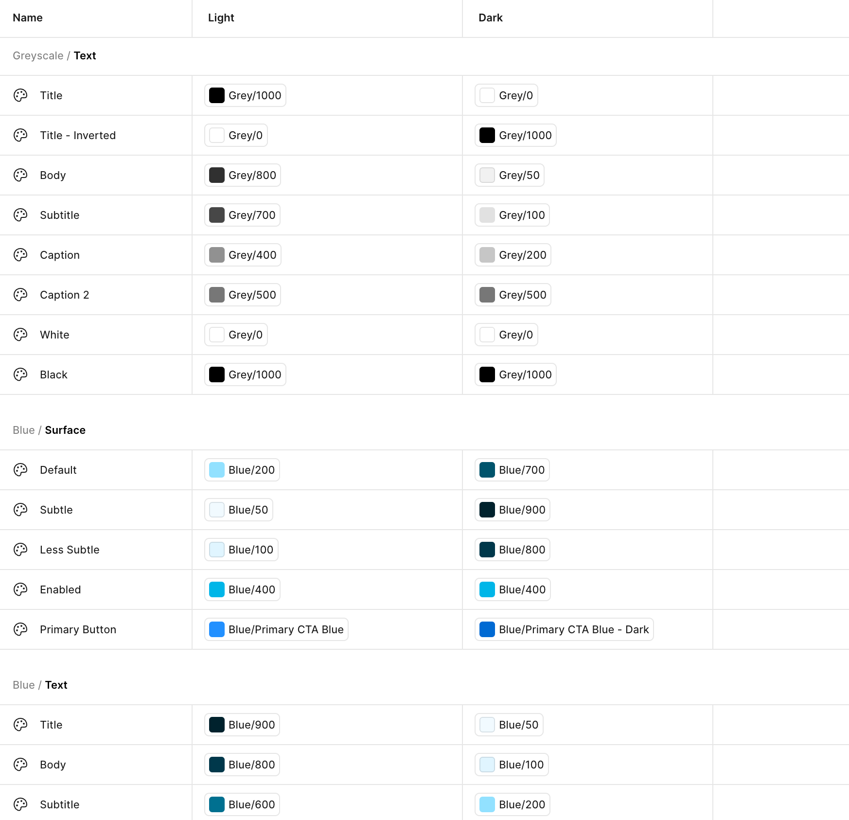
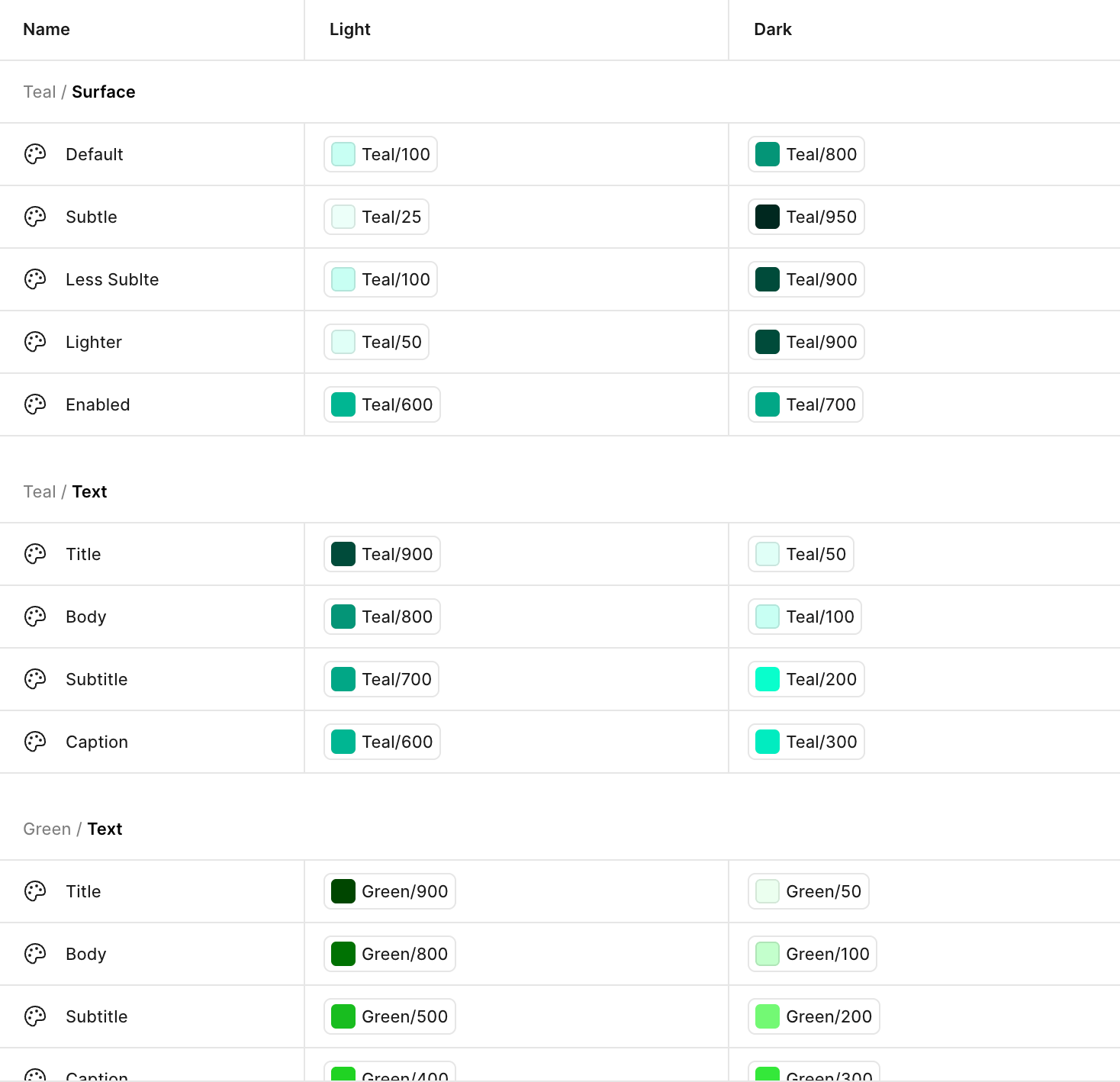
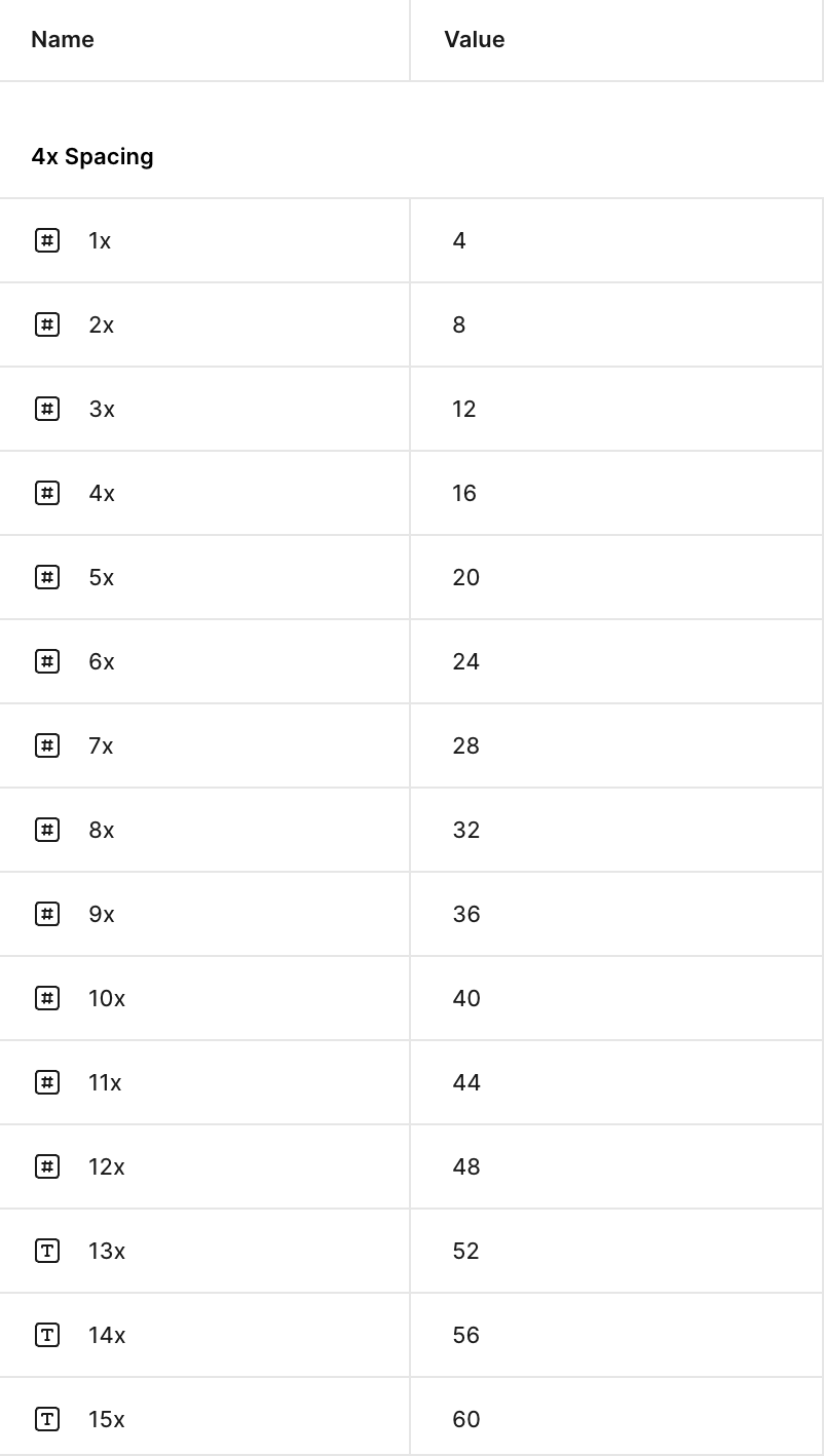
Text, spacing, and effects. The rest of the foundation. Every typographic role has a named style, from display down to caption. A single spacing scale is referenced by every gap, padding, and margin. Shadows, blurs, and overlays are codified so no surface reaches for an ad-hoc value.
Component library
87 components, 601 variants. Two components carry most of the visual weight.
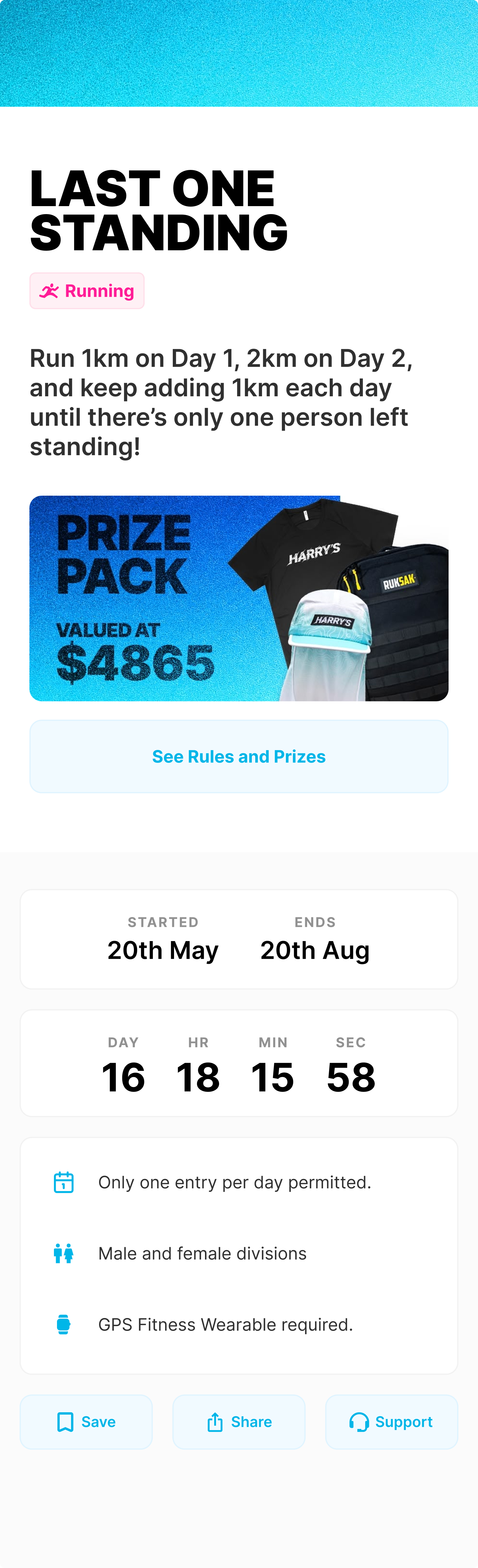
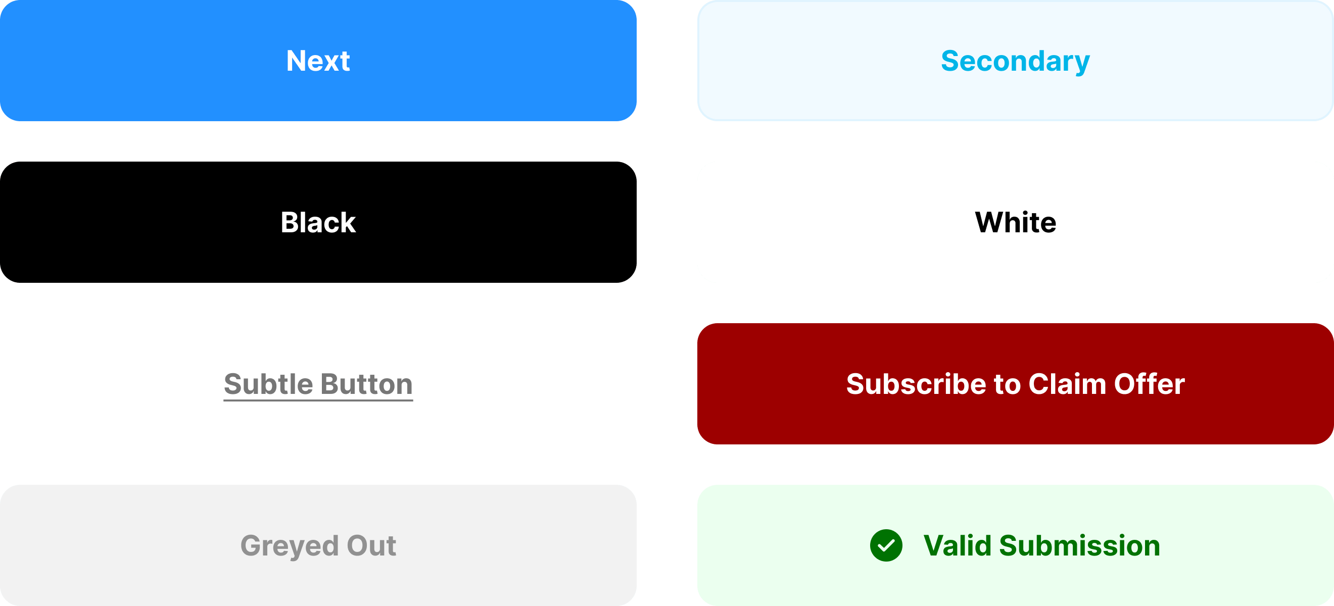
Button. The most-used component in the system. Variants for size, hierarchy, state, icon position, and disabled. Every CTA in the app comes from a single source.
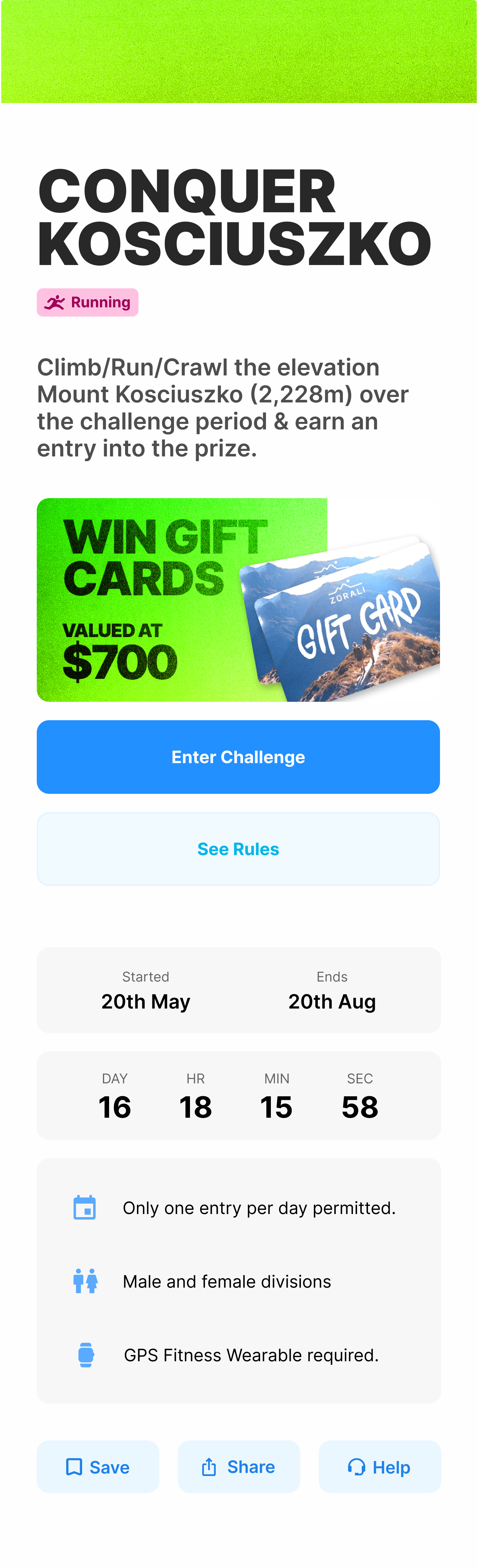
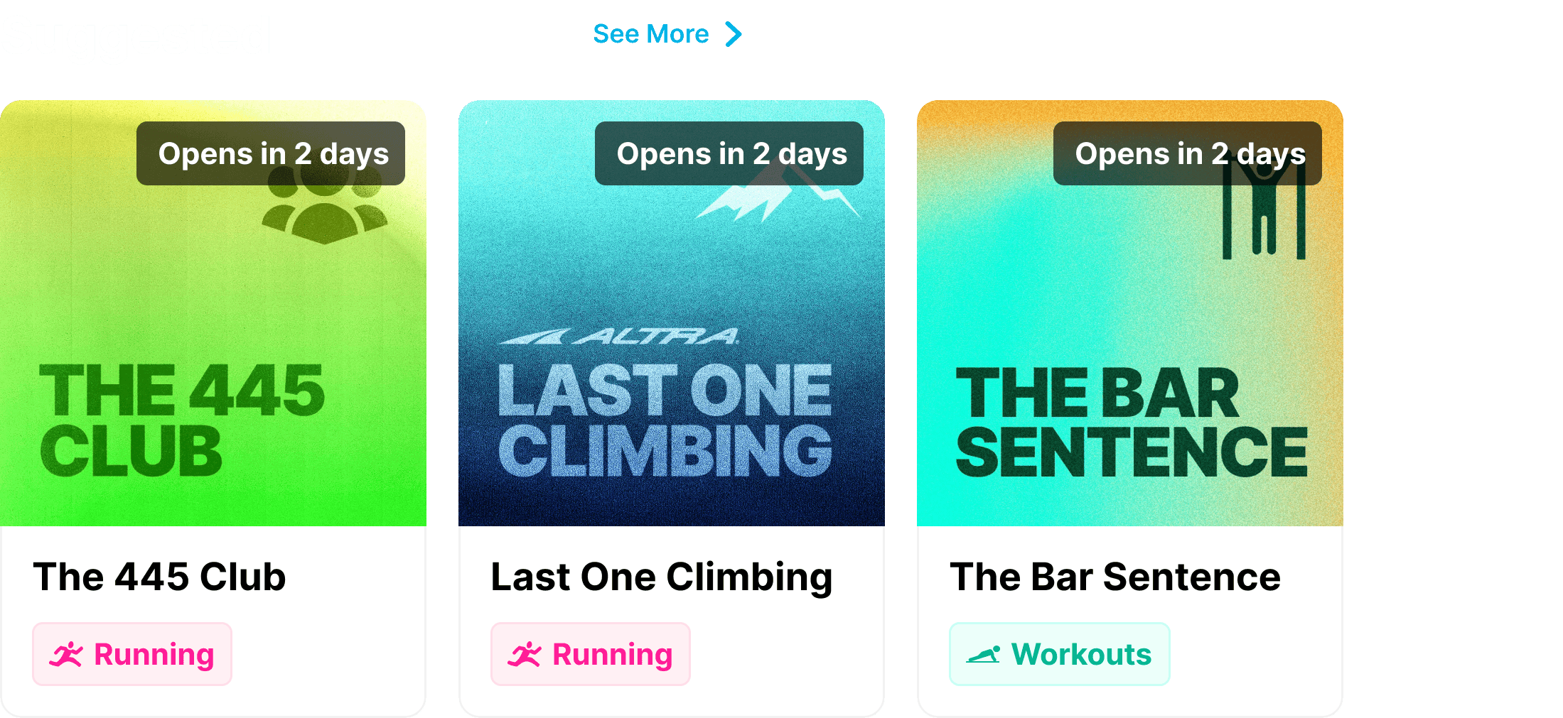
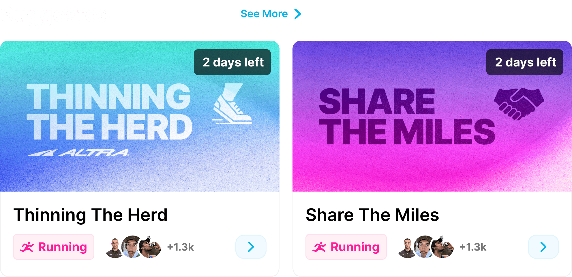
Challenge tile. The core product object. Variants for format (single entry, one per day, multi-stage), state (live, locked, completed, sold out, eliminated), and prize layer. The hardest component to systematise and the most domain-specific.
Dev handoff
The handoff workflow is layered. Engineering opens designs in Figma dev mode for spec, reads annotated frames for non-obvious interaction behaviour, and watches Loom walkthroughs for any flow with custom motion or edge-case handling. Three formats covering three failure modes: missing measurements, ambiguous interactions, and unanticipated states.
Outcome
The system powers 337 live production screens with 148 in pipeline. It is the single source of truth for the engineering team across iOS, Android, and backend.
Beyond the numbers, the value shows up in pace. New screen builds start from existing components and tokens instead of from a blank canvas. Visual inconsistency between releases has stopped being a recurring engineering question. The system absorbs new requirements (a new state, a new variant) without forcing a redesign of every surface that uses the component.
What’s next?
The next investment is a badge system v2. The current badges scale cleanly by variant, but the next iteration will add motion, rarity tiers, and a path for sponsor and partner brands to live inside the reward economy without diluting it.