Hardcore Harry's
From sketches to a live and thriving fitness platform
Role
Lead UX/UI Designer (August 2023 - February 2026), promoted to Lead Designer (February 2026 - present)
Timeline
2.5 years, ongoing
Team
Sole designer. Lead UX and UI for a 3-engineer team (iOS, Android, backend) across multiple time zones.
Shipped
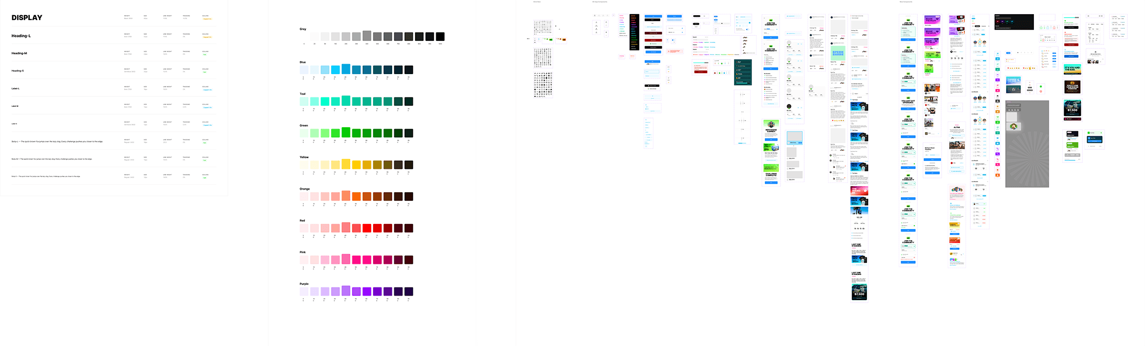
A consumer fitness challenge app live on iOS and Android, $260K AUD in lifetime paid entries, 4.9 stars on the iOS App Store (191 reviews) and 4.8 on Google Play (57 reviews), and a design system of 87 components powering 337 production screens.
Context
Hardcore Harry’s started as a vision: a highly engaged fitness community that fed off each other’s progress and hunger to push themselves. Cash and partner prizes were the surface incentive. The real point was belonging to something bigger.
The founders had been running Get Going, an established mobile personal training business, when they began standing up Harry’s as a separate brand and product. I had spent the previous year at Get Going on creative strategy and design. As Harry’s started to take shape, they pulled me across from its inception. There was a brief, a domain, sketches, and a vision document. There was no app yet.
The first surface wasn’t even a product. It was an online community where the brand promoted users’ achievements and started building the audience. The app came next, as the place that community would convene to actually take on the challenges.
The business goal was uncompromising: build a consumer fitness product that could grow without paid-ad scaffolding, generate real revenue from challenge entries, and feel like a place users wanted to be in rather than a utility they tolerated.
Process
I started where the brief started. Paper sketches, on the kitchen table, with our founders. The first decision wasn’t visual. It was: what is this product, really?
Strava is a tracker. Most fitness apps it inspires are trackers too. Harry’s wasn’t going to be a tracker. It was going to be a community where you entered challenges, competed against other people, and won real prizes for finishing them. The design had to lead with social proof and reward, not with charts and stats.
From those sketches I moved into Figma. Low-fidelity wireframes for the four core tabs: Home, Explore, My Challenges, Profile. Each tab was its own design problem. Explore had to make a sprawling library of challenges feel browsable. My Challenges had to give users a sense of momentum without overwhelming them. The Profile had to feel like something users wanted to show off, not a settings screen. The Home tab had to read like a social feed first and a product surface second.
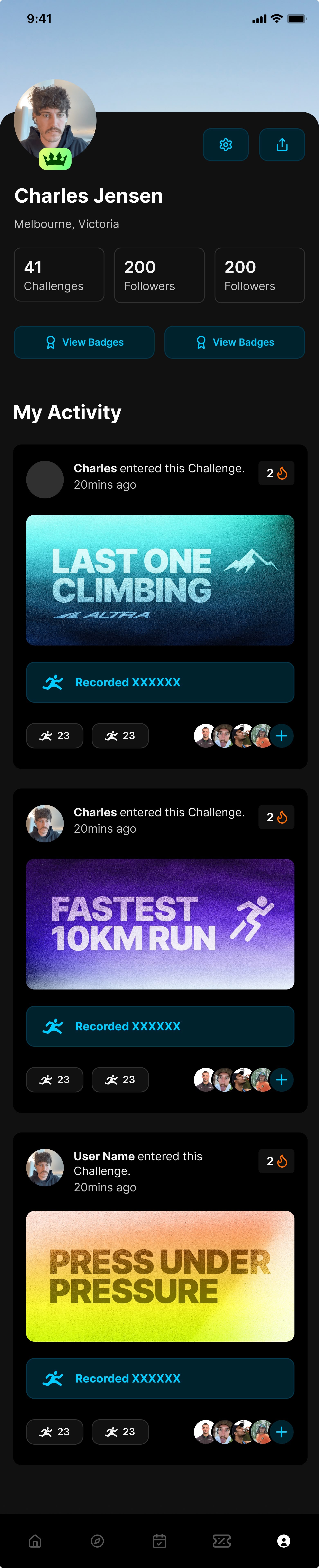
A big early call was committing to a social feed as the front door. A lot of fitness apps push you straight into your own data. Harry’s pushes you into other people’s activity. That decision shaped almost everything that came after, including the Profile design, the badge system, and the way challenge entries appear in a user’s feed as a reactable event.
The build went live in early 2024. From day one, I worked directly with a 3-engineer team across multiple time zones. Async Figma reviews replaced standups. I wrote handoff notes inside Figma frames, recorded Loom walkthroughs for tricky interactions, and shipped weekly. There was no PM. Product calls happened between me, the founders, and engineering.
Solution
The live product runs four core tabs and a content layer underneath them. Every surface is designed and shipped with both light and dark themes.
Home is a Strava-style social feed where users see other users’ challenge entries, react to them, and follow their progress. It is the surface that has driven most of the organic engagement, and where I spend the most time iterating.
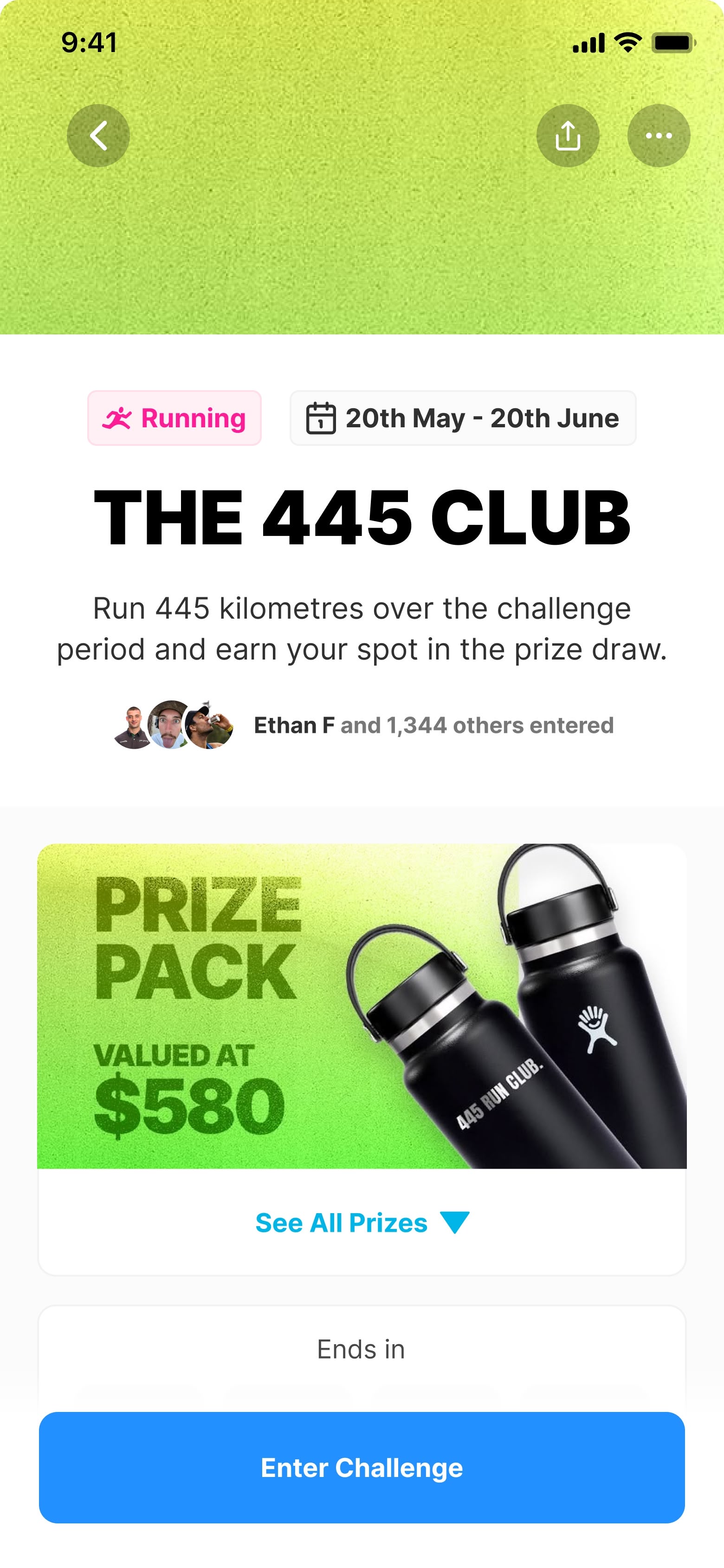
Explore organises the live challenge catalogue into three formats: single-entry, one-per-day, and multi-stage. Filtering by discipline (running, cycling, swimming, workouts) is built into the surface so users find their lane fast.
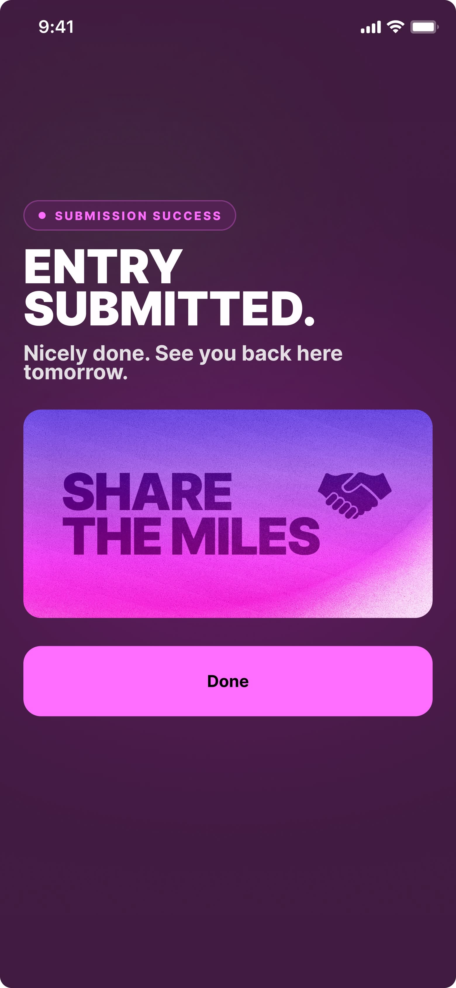
Drilling into a challenge surfaces format, dates, prize layer, partner tags, and the call to enter.
My Challenges tracks active and completed entries, surfaces a user’s current momentum, and shows the tickets they have earned for the monthly prize draws.
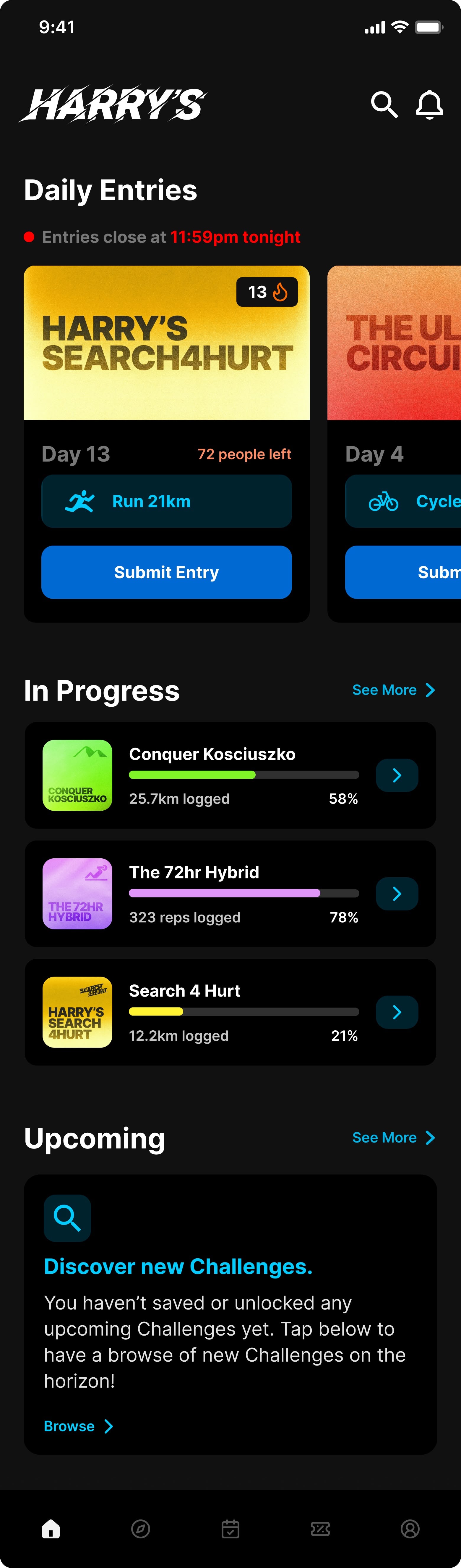
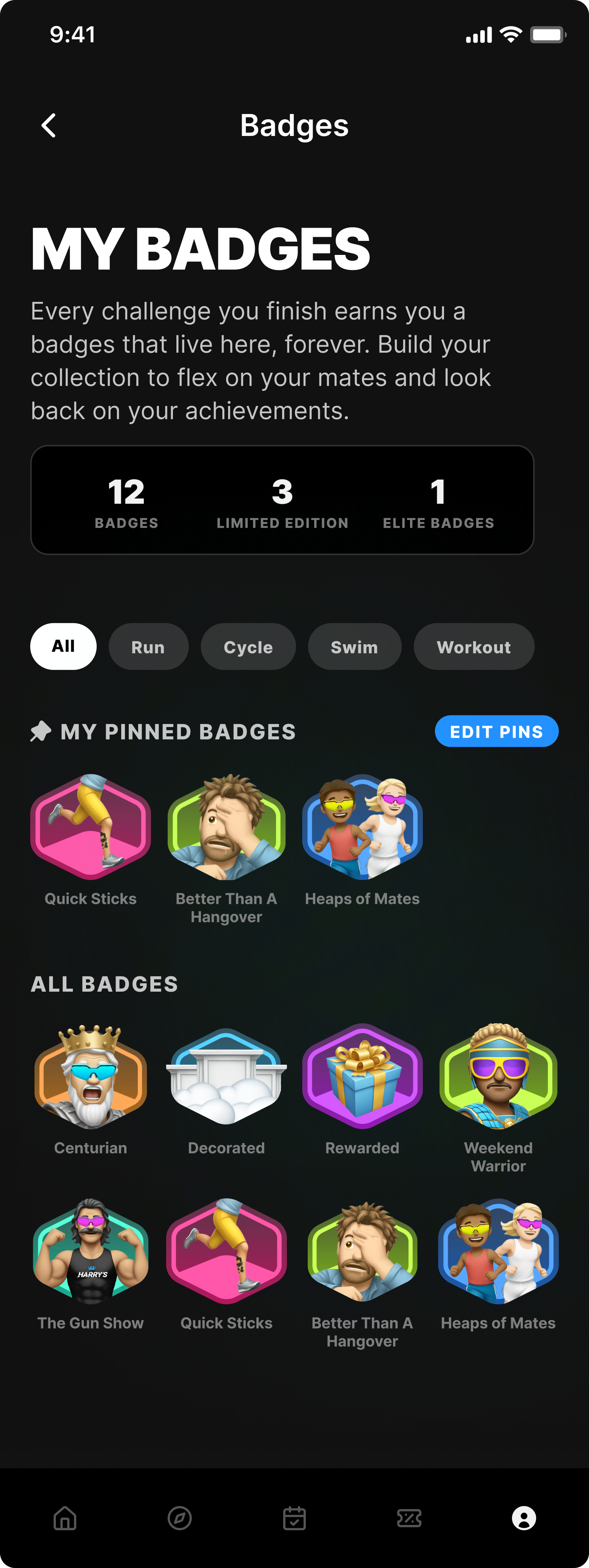
Profile and badges is where users show off achievements. I designed a library of in-app badges that users earn for completing challenges. Badges appear on profiles and on feed entries, which created a flex loop that drives both re-entry and word-of-mouth.
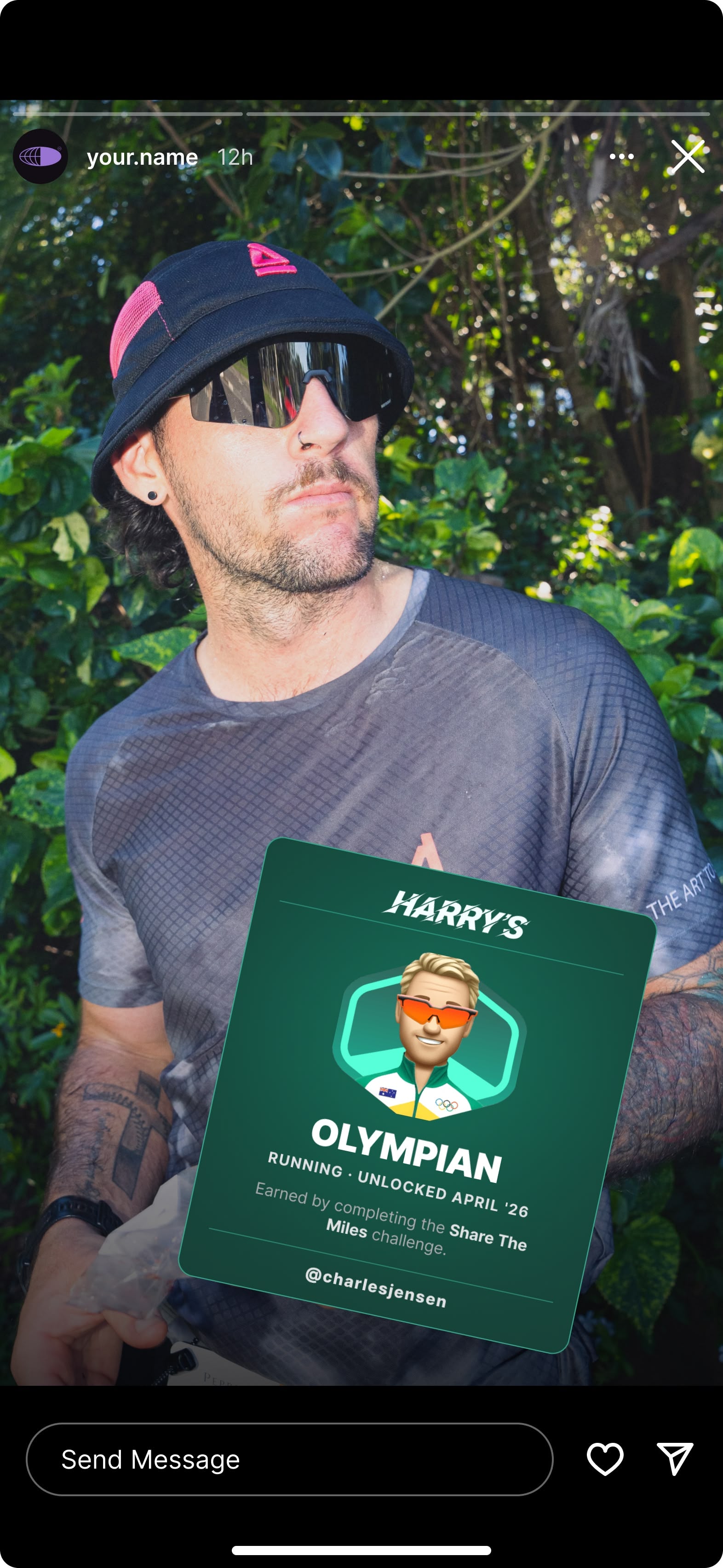
Badges also extend out of the app. Users can share their completion moment to Instagram Stories on a branded template, looping word-of-mouth back through social.
Two recent additions extend the surface.
Challenge Series is the evergreen progression layer currently in implementation, designed to sit on top of the time-gated catalogue. Detailed in its own case study.
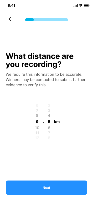
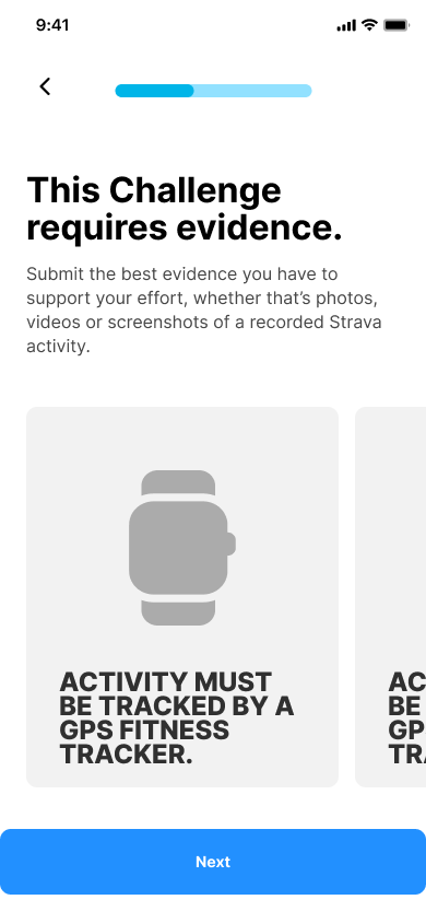
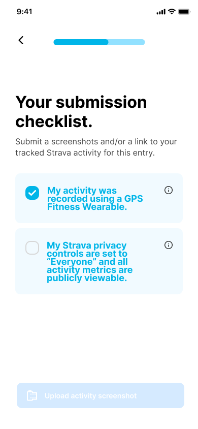
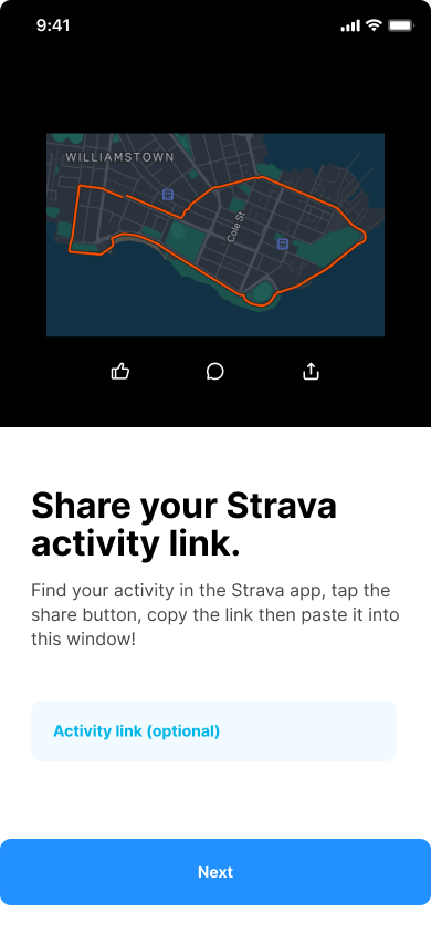
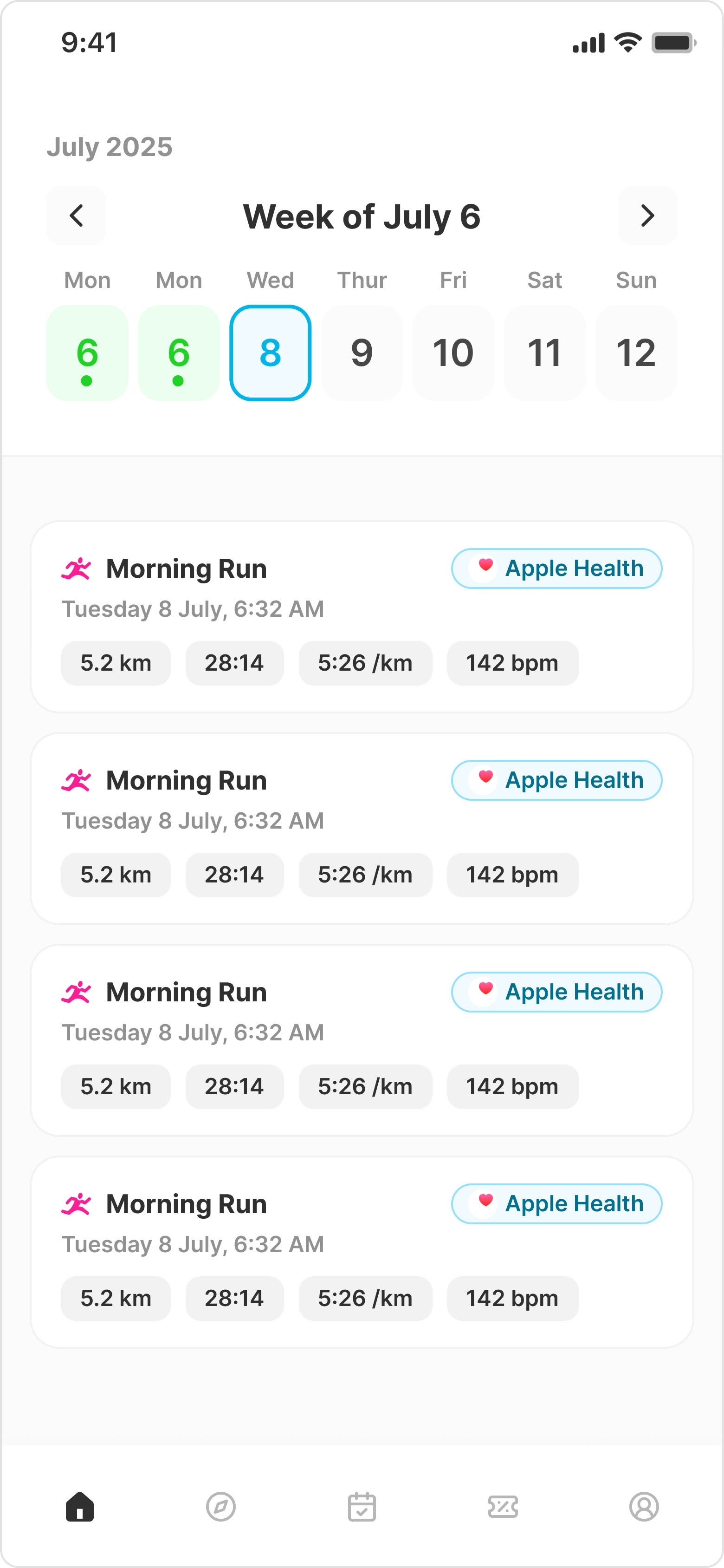
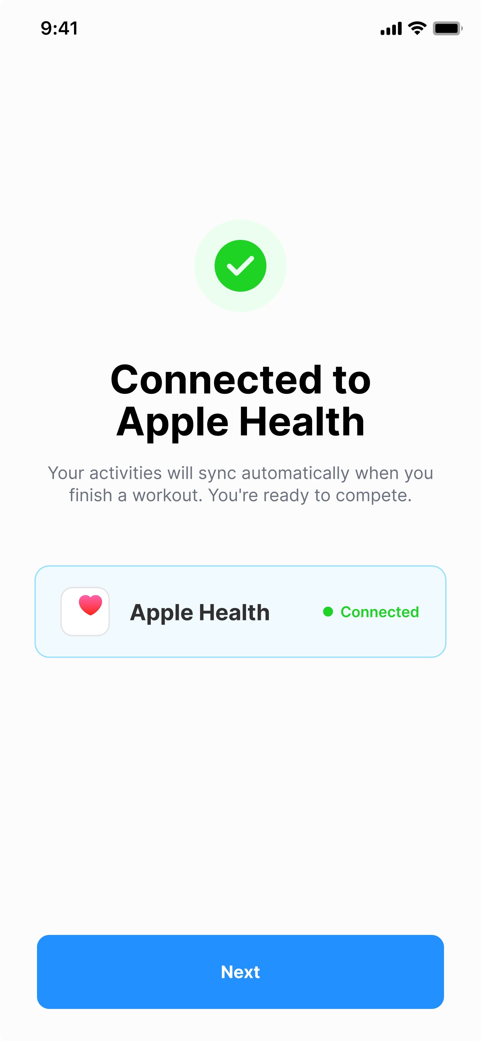
Apple HealthKit and Google HealthConnect integrations removed the manual Strava-link and screenshot uploads that previously gated challenge entries. Users now import an activity directly from their smartwatch and it is automatically verified, with anomaly flagging for suspicious entries. The change cut the entry path from a multi-step uploader to a single tap.
6 taps became 4.
Screenshot upload and paste replaced with a single signed activity import from HealthKit and HealthConnect. Fewer taps, fewer drop-offs, more entries submitted.


Under all of it sits a design system. 87 components, 601 variants, 337 live production screens, and 148 screens in pipeline. Detailed in its own case study.
The full product in motion, as a single walkthrough.
Outcome
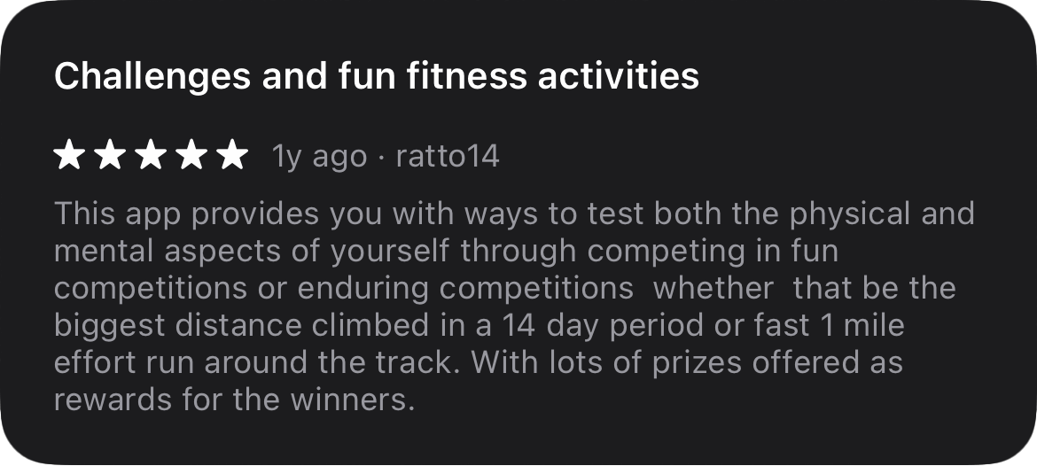
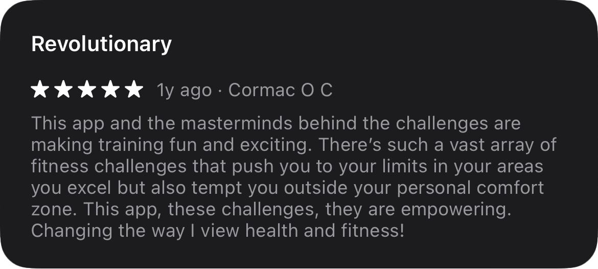
The app holds 4.9 stars on the iOS App Store (191 reviews) and 4.8 on Google Play (57 reviews) across 10,000+ installs. Lifetime paid challenge entries have generated $260K AUD in revenue across 1,082 entries, with $94K booked in the first half of 2026 alone. 170 active subscribers drive $24K ARR. In the first half of 2026, 2,101 new users joined and entered 15,542 challenges between them.
The numbers describe the scale. What users actually say describes the why.
Hardcore Harry’s now operates as its own brand and product. In February 2026 I was promoted to Lead Designer.
What’s next?
148 new screens are in pipeline. Most are second-order surfaces extending Challenge Series, the social feed, and a new sponsor integration layer. The product is moving from “fitness challenge app” toward “community fitness platform”, and the design work is shifting with it.